Flyer Maker, Poster Maker
- 4.8
- Rating
- 10.00M
- Installs
- Free
- Price
 Analysis by App-foxy
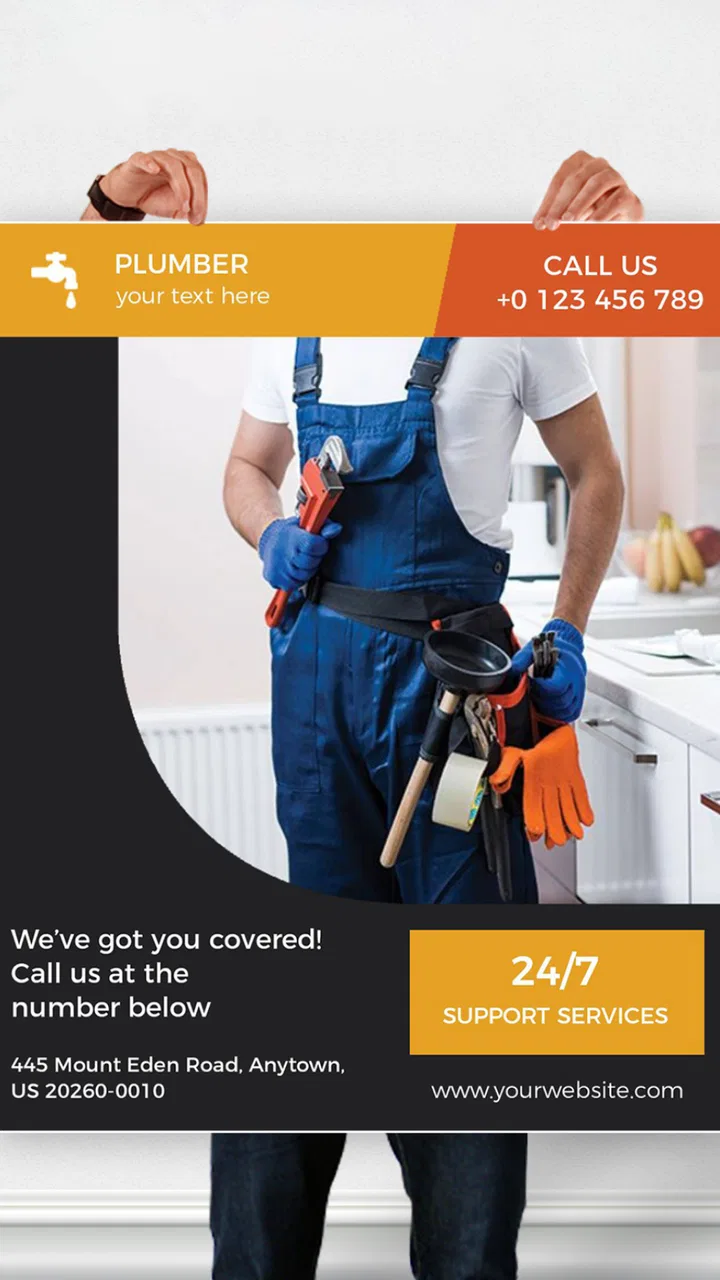
I started using Flyer Maker, Poster Maker when I needed to turn a simple announcement into something presentable without opening a desktop design program. It is an art and design app from Apps You Love, aimed at people who want to create flyers, posters, and similar visual material directly on a phone or tablet. My first impression was that it is built for speed rather than professional-level control: choose a starting layout, adjust the content, and produce something ready to share.
That focus makes sense for everyday jobs. A local class, a small sale, a birthday gathering, a community notice, or a social post can all benefit from a cleaner design than a plain block of text. I would not treat it as a replacement for a full desktop editor, but I do see its value when the priority is getting a usable result quickly. The free entry point also makes it easy to test before deciding whether the paid elements fit your workflow.
How the app feels in current use
The app sits in the Art & Design category, but its practical appeal is closer to a quick visual communication tool. I found myself thinking less about drawing and more about arranging information: what should people notice first, how much text can fit comfortably, and whether the final design still looks clear on a small screen. That is a useful distinction because the app is better suited to composing promotional or informational graphics than to detailed illustration.
You May Also Like

 Blood Strike: 2.5 Anniversary
Blood Strike’s Loadouts Turn Every Drop Into a Tactical Gamble
A close look at Blood Strike’s custom loadouts: how fast access to signature weapons reshapes its battle royale rhythm, rewards preparation, and narrows the gap between fights.

 Pandora - Music & Podcasts
Pandora’s Music Is Easy to Start, but Harder to Recover
Pandora’s strength is its low-effort path from a seed to a station. Its weak spot is how much confidence it asks you to place in connection, setup, and quiet recovery.

 8 Ball Pool
 Is Built on Rivalries, Rematches, and Routine
A close look at the rivalries, rematches, shared routines, and unanswered safety questions that turn a quick pool match into a persistent mobile community.

 Samsung Music
’s Quiet Strength Is Playing What You Already Own
Its reach comes less from spectacle than from dependable access to a personal library. That simplicity is both the app’s strongest retention engine and its ceiling.

 AccuWeather: Weather Radar
AccuWeather Review: A Quick, Clear Forecast for Everyday Decisions
For everyday plans, the best forecast is the one you can understand quickly. AccuWeather makes rain timing, radar, and local conditions easy to act on, with a few trade-offs.

 Hill Climb Racing
Why Hill Climb Racing Still Turns Crashes Into One More Run
A tiny car, a bumpy hill and one more upgrade: Hill Climb Racing keeps resurfacing because its simple chaos makes every near-miss feel personal.
More From Our News Desk



The store presents it as a flyer maker with AI-assisted design creation, and the current experience is clearly aimed at reducing the blank-page problem. Starting from an existing visual direction is much easier than deciding on every color, size, and position yourself. For a first-time designer, that guidance can be the difference between finishing a project and abandoning it halfway through.
I especially liked the way a template-based workflow can help establish hierarchy. A good flyer usually needs a prominent title, a supporting detail, and a clear action or date. If all of those elements receive equal visual weight, the result becomes difficult to scan. My practical advice is to write the message before opening the editor, then keep only the information that someone needs at a glance. The app can arrange visual elements, but it cannot rescue an overloaded message.
For a realistic everyday example, imagine organizing a weekend bake sale. I would begin with the event name, location, time, and one short line explaining what is being sold. I would then choose an image or visual style that supports the subject instead of competing with it. Before sharing, I would check the design at the size people are likely to see first on their phones. Small text that looks acceptable while editing can become frustratingly hard to read in a messaging app.
What the current version is good at
The current version is 170.0, and the product has been available since February 2018. That history matters because this is not a brand-new experiment trying to prove that mobile design is possible. It has had time to settle into a recognizable purpose: helping ordinary users create finished-looking promotional graphics without requiring a design background.
Its audience is broad. A student can use it for a club announcement, a shop owner can prepare a simple offer, and a parent can make an invitation without learning a complicated design suite. I also think it suits people who produce visual content occasionally. If I only need a poster every few weeks, a focused mobile app is less intimidating than a large creative platform filled with tools I will not use.
The app is free to install and carries an Everyone age rating, which lowers the barrier for casual experimentation. It includes in-app purchases ranging from $2.99 to $99.99 per item, so I would still approach the design process with a clear idea of what I need before committing to anything. The free starting point is useful, but “free” does not mean every asset or creation route will necessarily be available without an optional purchase.
One of the strongest practical habits is to make a reusable content outline. I would keep a note containing the exact wording for a recurring event, along with the preferred contact details and any legal or practical information that must not be omitted. Then I could use the app for visual variations instead of rewriting everything from memory. This reduces mistakes and makes it easier to compare a bold poster with a quieter, more informational version.
How the product’s evolution affects the workflow
The combination of a long-running product and the current version suggests an app that has continued to develop rather than remaining frozen around its original concept. The most important effect for existing users is familiarity: people who already understand the basic flyer-making process are likely to benefit from continuing improvements without having to move to an entirely different kind of tool.
At the same time, I would separate confirmed current capabilities from assumptions about future development. The presence of AI in the store summary makes it reasonable to expect assistance with generating design ideas, but I would not treat that as a guarantee that every result will match a specific brand or communicate a nuanced brief perfectly. AI can speed up the first draft; it does not remove the need for editing, proofreading, and judgment.
That distinction is important for business use. If I were preparing a graphic for a small service, I would use automated suggestions to explore directions, then manually check the wording, contrast, spacing, and contact information. A visually attractive mistake is still a mistake. The more important the announcement, the less I would rely on an untouched first result.
Existing users may also appreciate the way a mobile-first workflow changes where design happens. I can work during a commute, between appointments, or while standing in a shop, rather than waiting to reach a computer. That convenience is not just about speed; it changes the kind of projects that feel worthwhile. A quick notice that would never justify opening a desktop editor can become a polished graphic in a few minutes.
There is a trade-off, though. Phone screens are comfortable for choosing and adjusting individual elements, but they are not ideal for judging every detail of a complex composition. I recommend zooming out before finishing and checking whether the title still dominates, whether the margins feel balanced, and whether the design remains understandable without the surrounding editing controls.
Specific techniques that make better results
My first non-obvious tip is to design for the destination, not just for the editor. A poster intended for printing needs different priorities from a graphic sent through a chat group. If the image will mainly be viewed on a phone, I would favor fewer words, stronger contrast, and a title that remains recognizable in a small preview. If it will be printed, I would inspect fine text and edge spacing more carefully before considering the job finished.
My second tip is to create two versions from the same idea: one with the full information and another with only the essential message. This is useful when a design will appear in different places. The detailed version can serve as a notice, while the shorter version can work as a social image. Trying to force both purposes into one crowded layout is usually less effective than adapting the message.
My third tip is to treat images as part of the information hierarchy. A decorative picture may look attractive, but if it pulls attention away from the event name or offer, it weakens the design. I would choose imagery that explains the subject or establishes the mood, then reduce other visual distractions. This is particularly important when using automated suggestions, because a visually energetic result is not always the clearest one.
A fourth useful workflow is to proofread after changing the layout, not only before. Text can be shortened, moved, or resized during editing, and those changes can introduce awkward line breaks or remove context. I would read the final design as a stranger would, starting at the top and asking whether the purpose is obvious within a few seconds.
Where it still falls short
The app’s convenience comes with limits. Mobile editing is excellent for quick compositions, but I would not choose it for a project requiring extremely precise alignment, detailed photo retouching, advanced typography, or a large set of coordinated brand materials. A desktop design application remains the better choice when every measurement and layer needs close control.
I also would not recommend it to someone whose main goal is free-form digital painting. The app’s value is in making visual communication, not in replacing a dedicated drawing or illustration workspace. Likewise, a professional designer who already has an established system may find the simplified workflow restrictive rather than helpful.
The purchase structure deserves attention as well. Since optional items can range from a few dollars to a much higher amount, I would avoid beginning a project around a particular premium element unless I already know it fits my budget. The sensible approach is to explore the free workflow first, decide whether the app’s editing style suits you, and only then consider paid additions.
Another limitation is the difference between a polished starting point and an original visual identity. Templates and assisted creation can help a beginner avoid obvious design mistakes, but they can also encourage familiar-looking results. For a personal invitation or one-off notice, that may be perfectly fine. For a business trying to stand apart, I would use the app as a drafting tool and add a more deliberate brand direction through consistent colors, wording, and imagery.
Who should use it and who should skip it
I would recommend it to anyone who needs a respectable flyer without a long learning curve. It is particularly practical for small organizations, independent sellers, students, families, and occasional event organizers. The app also makes sense for people who work mainly from a phone and do not want to transfer every small project to a computer.
I would be more cautious for users who need guaranteed control over production details, extensive collaboration, or a sophisticated asset-management system. Those needs usually point toward a broader design platform. The same is true for a person who wants to create a complete visual identity rather than individual posters. In that situation, consistency across many formats matters more than the convenience of making one attractive graphic quickly.
Its popularity gives it some useful reassurance: it has more than 10 million installs and holds a 4.7 average from around 374 thousand ratings. Those figures do not prove that it will suit every workflow, but they do show that the app has reached a substantial audience and that many users have found its basic approach worthwhile.
What I would watch before committing
If I were deciding whether to keep using it, I would watch how well the AI-assisted starting points respond to specific instructions, how much editing is possible after a design is generated, and whether the free tools are enough for the projects I actually make. Those questions matter more than the number of templates or visual effects because they determine whether the app saves time in real use.
I would also pay attention to export quality for the intended destination. A design can look excellent inside the editor and still need adjustment when shared, printed, or viewed as a small thumbnail. My routine would be to create a test version, send it to myself through the channel where it will be used, and inspect it away from the editing screen.
Finally, I would judge the app by the complete workflow rather than the first attractive result. Can I find a suitable starting point, edit the wording comfortably, keep the important details readable, and finish without spending more than expected? If the answer is yes, the app earns its place as a practical mobile design companion. If I repeatedly need advanced control or paid elements to make basic work possible, a different tool would be a better long-term choice.
My overall view is positive, with the right expectations. Flyer Maker, Poster Maker is most convincing as a fast, approachable way to turn an idea into a shareable visual. It does not replace professional design software, and its optional purchases mean I would check the cost of a preferred workflow before relying on it. But for everyday flyers and posters, especially when time and simplicity matter, I think it is a genuinely useful app to keep available.
FAQs for Flyer Maker, Poster Maker
01What features does the Flyer Maker, Poster Maker app offer?
The Flyer Maker, Poster Maker app provides a variety of templates for creating professional-looking flyers and posters. It includes tools for customizing text, adding images, and using various fonts and colors. Users can also access design elements like stickers and backgrounds to enhance their projects, making it suitable for both personal and business use.
02Is the Flyer Maker, Poster Maker app user-friendly for beginners?
Yes, the Flyer Maker, Poster Maker app is designed with a user-friendly interface, making it accessible for beginners. It offers step-by-step guidance and intuitive controls, allowing users to easily navigate through the design process. Tutorials and tips are also available to help users make the most out of the app's features.
03Are there any costs associated with using Flyer Maker, Poster Maker?
While the Flyer Maker, Poster Maker app is free to download, it may offer in-app purchases. These purchases can include premium templates, additional design elements, or ad-free experiences. Users can choose to use the free version or opt for paid features to enhance their design capabilities.
04Can I use my own images in the Flyer Maker, Poster Maker app?
Yes, the app allows users to upload their own images to personalize their designs. This feature enables users to incorporate personal photos or branded images, adding a unique touch to their flyers and posters. The app supports various image formats, providing flexibility in design.
05Is the Flyer Maker, Poster Maker app available for both Android and iOS?
Yes, the Flyer Maker, Poster Maker app is available on both Android and iOS platforms. This ensures that users can access and utilize the app’s features regardless of their device. It can be downloaded from the Google Play Store for Android devices and the App Store for iOS devices.
Pros
- User-friendly interface for easy design.
- Wide range of customizable templates.
- High-quality graphics included.
- Quick sharing to social media platforms.
- Supports multiple design formats.
Cons
- Limited free features without subscription.
- Occasional in-app ad interruptions.
- Requires internet for full functionality.
- Some templates can be repetitive.
- Limited font variety in free version.

Flyer Maker, Poster Maker
Gallery